Essays / Exhibition news / Publications

Bums on Seats Part VII - Artwork Review

It might have taken five months to execute but “Bums on Seats” is now finished. Five months you say?! That’s ages! Well, let’s be glad that it wasn’t twelve as the concept points out - a year of analytical data on canvas that represents the weirdly obsessive nature of being a virtually present artist. Parts one to six of this essay series cover the original ideas, developments and other such matters (so start there if you’re new to this) but this one is a review - so was it all worth it?

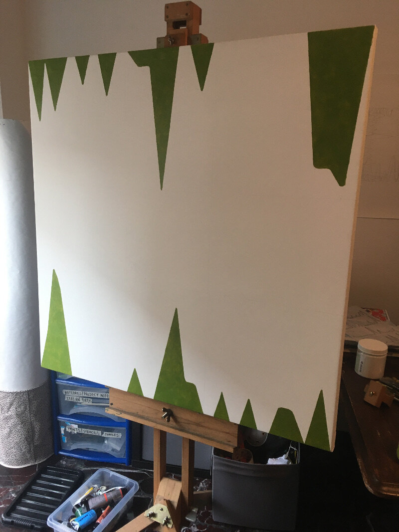
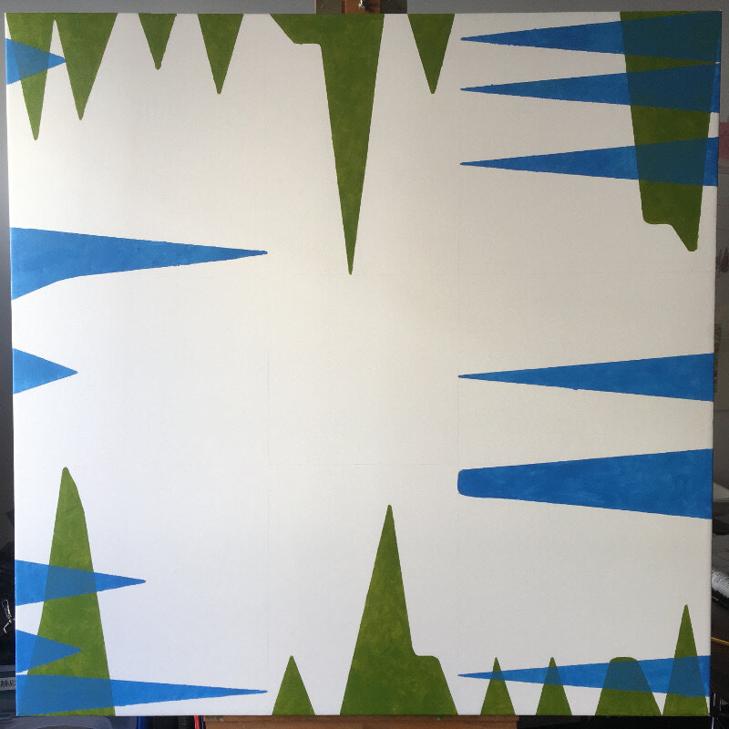
I think it certainly looks good; it’s quite close to what I had imagined back in August (gallery image 1) but the main observation would be that it now sits in a curious place between statistical exactitude and layered abstraction. The balance between the monthly colours was planned to flow from green back to green again (each one being a slightly different tint from the last) but threw up some difficulties in getting the right levels of medium transparency. But that’s just technical really- the overall effect is in keeping with its purpose.

The negative space works well and certainly reveals some patterns as to how my website is working. It has been perplexing to see people going mad for it one day but quieter than Hillary Clinton’s victory parade the next. One regret is not introducing some indicator of geography for “Bums…” which could have added extra meaning to it but nevertheless, it’s evident from this work that the site is at its hottest in the middle of the month. Do bigger numbers make you a better artist? Do lower ones make you a bad one? It’s a very modern dilemma but one that I hope that this work raises.

Working on canvas again after such a long time would be another positive that I can take from this piece. In fact, to have one hanging on the wall makes a refreshing change (gallery image 7) and producing a more subtle yet varied colour palette was fun (as opposed to “First Past the Post”, which was a straight from the tube affair).

I’m also happy to announce that “Bums on Seats” will be exhibited at the upcoming Fourth Edition of the Virtual Art Fair. Opening January 29th Curated by Lucy Fiona Morrison

Web link thevirtualartfair.co.uk/

Instagram @thevirtual.artfair

Bums on seats Part V (goodbye base camp)

base camp.JPG

It seemed a shame to ruin it really, this satisfyingly square first attempt at a canvas. Last week’s fear over what to do next turned into what I can only describe as a modernistic inertia, as it sat in the studio waiting to be defiled. I had built it up too much; that first gestural mark felt like it had to encapsulate everything that I’ve written about so far: the internet, attention culture, the old theatre crowd, colour theory and the death of interest. All things considered, this reluctance is the down side of having a clear concept in mind, there could never be anything spontaneous or automatic about this work, otherwise it would be a stab in the back- if only with a paintbrush. Yet, working to a plan gives a visual idea some semblance of intention and meaning, especially when something as flippant as colour comes crashing into the room; such a thing can throw you completely. A plan honours the original idea; if something stuck out in your mind as being better than something else in the beginning, then why not try to stay as close to that moment as possible?

I have said many times before that my work comes from the concept, a contextual version of base camp if you will. The best route, potential hazards and the appropriate equipment all depend on what’s decided over bacon and eggs- how do we get to the top without dying or losing sight of why we’re even here? They say each mountain climb is different and that goes for making art too but to continue this ‘lofty’ analogy would give you altitude sickness sooner or later so let’s get to the point- the interesting thing about “Bums on Seats” (working title) is that it carries on from “First Past the Post” and “Straight from the horse’s ass” in the sense that they are all rigorously planned, painted abstractions that represent a system. I say interesting because producing three examples of similar work in close succession is strange for me- I should be bored with it by now.    

Onto the painting itself- I have started out with the data that relates to January and February. The composition relies on each edge of the canvas serving as the original x axis and the centre as the void that the subjects try to reach into. I’m looking for some balance within the painting so the matching colour spikes (relating to page views, visitors etc) will mirror each other from opposite sides. After conducting some experiments recently I am choosing colours that worked, or at least complimented or blended into each other to form a range of darker tones. As the layers become more complex I hope to see some colours either dominate or fade at first glance (in the same way that visitor hits from earlier this year barely seem relevant to what’s happening now, even if was an impressive statistic at the time).

My knowledge of oil paint is sketchy at best so this piece is being made with gloss medium and acrylics. Using the former would be like going up K2 without any decent boots…

Straight from the horse's ass (Part 3)

The as yet untitled work about the duality of power is now complete. These photographs of sheet five (taken over a period of five or six hours- click to enlarge) show my method, which in itself was entirely driven by rules; firstly dividing the shadows into blocks and then layering them up like a screenprint. Again, here we can see how the reverse side of the piece shows through the masked, negative spaces of the other.

The statue depicted here is of Emanuele Filiberto, ‘Testa di Ferro’ in Piazza San Carlo, Turin. A character of considerable fame from sixteenth century Italy, namely because he made Italian the official Savoy language instead of Latin and moved what became the Turin Shroud to the city cathedral. He is also known however, as being a ruthless strategist and exploited any weaknesses for his own ends. My inclusion of him in this project reflects the unavoidable problems related to how powerful people have to present themselves. What are they hiding? What don’t we know? Such ‘PR’ battles and embarrassing ‘reveals’ dominate our news feeds these days but monuments like this one have a wonderfully bombastic way of ignoring everything but heroism- so much so that you get drawn into the romance of it before anything else.

I think the work has been a success; power is portrayed in a graphic sense but it’s also abstracted due to the complimentary colour scheme. Failures would lie in the difficulties I had in finding a workable technique and sometimes losing touch with the concept as a result. Above all, the work has been an intriguing one in terms of using painting to ask sculptural questions.

Coming up in part four:

Title

Once an appropriate venue presents itself, the five pieces will be mounted and placed together in a sequence/installation yet to be determined.

Straight from the horse's ass (Part 1)

The history of the horse and its consequent relationship to us has culminated in a complex symbol that has allowed us to produce a plethora of artistic interpretations. Horses make us think of strength, richness and perfection. Pictorially, they hold a place in art history as powerful representations of status. Even in common phrases and jargon: ‘the width of a horse’s ass’, ‘wins by a nose’ or indeed, ‘straight from the horse’s mouth’.

Along with ‘get off your high horse’ and ‘hold your horses’, they form the crux of what this piece is about. Relatively speaking, the preconceived ideas that we have about power have been interesting to investigate and transform into something visually.

Torino has had a particular role to play in the formation of what we now know as the Italian state: French occupation, the Savoia dynasty and the Risorgimento, things which are clearly in evidence by what we see in the streets and piazzas. The monuments therefore are vital for this idea of power and what it means to our urban environment.

When they were designed the idea was to immortalise people as national heroes using idealism, romance and the horse’s symbolic potency. However, such beautiful forms got me thinking about how they reflect on our current society? We still have leaders and important people but they are (and will be) presented completely differently. Politicians are eager to be seen as approachable, honest and thoughtful but we ironically know more about them and their flaws these days than say, Testa de Ferro or Ferdinand D’Savoia - but they are still public figures none the less and still have the same ambition and ruthlessness as those cast in bronze. The question is how much do current leaders wish to be seen or are seen as such?

The conception of the work and the representation of the two-faced nature of elitism and modern politics both came from this.

It struck me as interesting that (considering the perfect forms in front of me) that there are two different viewpoints from which any ‘immortal on horseback’ cannot not be seen and identified; from up the horse’s nose and from up its ass. The careful consideration of the sculptor and his workshop to convey the hero is lost with each example. Funnily enough all you are confronted with is either a strain of neck muscles or a pair of giant testicles.

I found this to be ideal territory for the new work, representative of the high society figure as a joke who can never fully achieve power because our society has become disinterested and hypercritical.

More to come in the next post on December 13

Timewasters...

These images make up part of an ongoing collection dedicated to lost time. The buffer screen is something that we are all familiar with and every single instance presents an interesting visual paradox. Each one is obviously part of something larger but because of a technical glitch the image becomes serendipitous and shown over a longer period than was intended. It gave me the opportunity to recognise formal qualities at random; something that you also do when presented with a painting or photograph that you haven't seen before.

No matter which platform that you are on, the loading symbol has connotations of frustration and 'dead time'... but purely because we are forced to look at it, the image behind it takes on much the same role that advertising does. You don't choose to look at it but it's there nevertheless.

Any guesses as to what they're from..?

Contribute with your own buffer moments #TimewastersArtProject. Further the collection!