Essays / Exhibition news / Publications

First Past the Post - Project Review

First Past the Post

March/April 2020


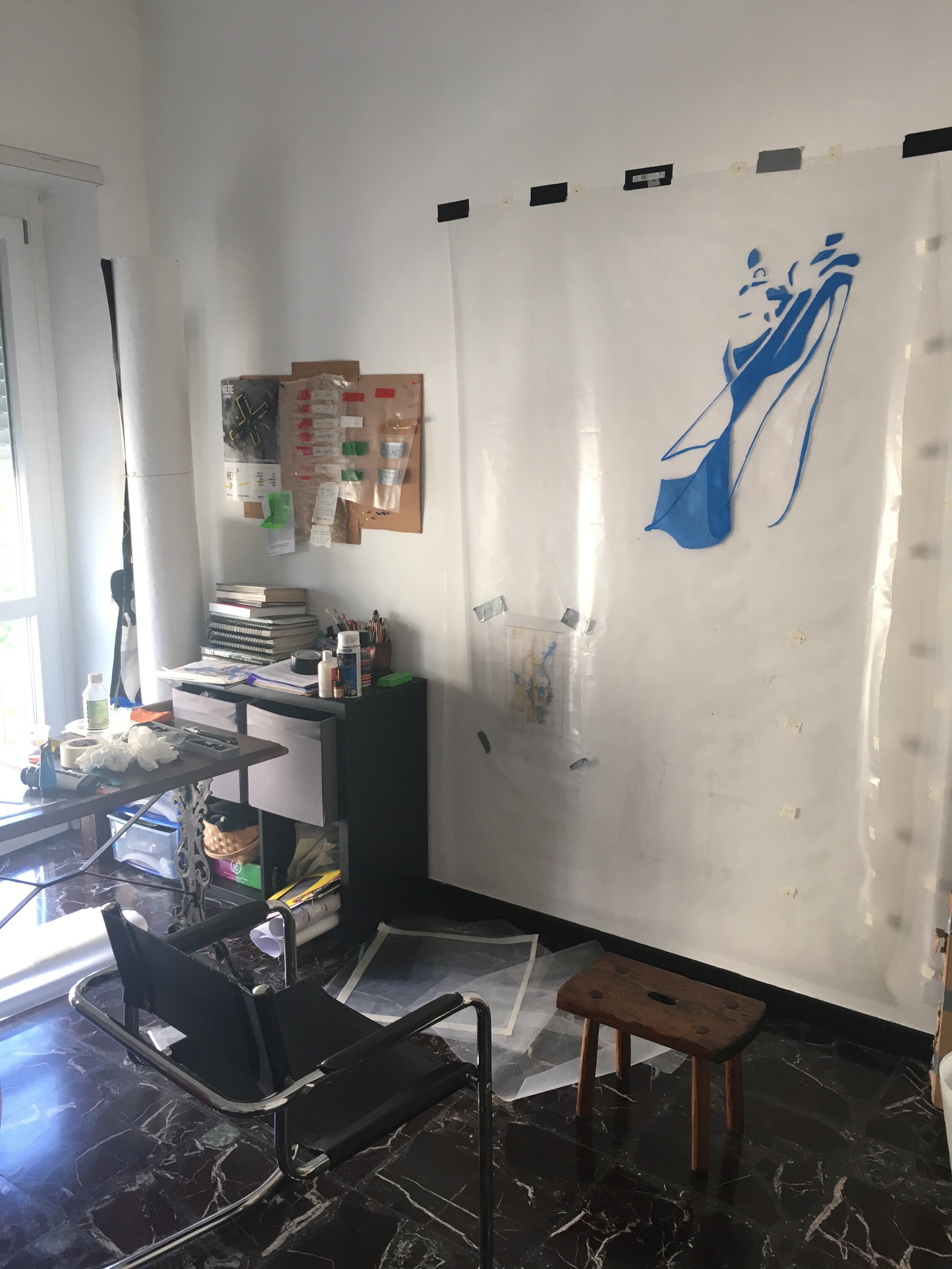
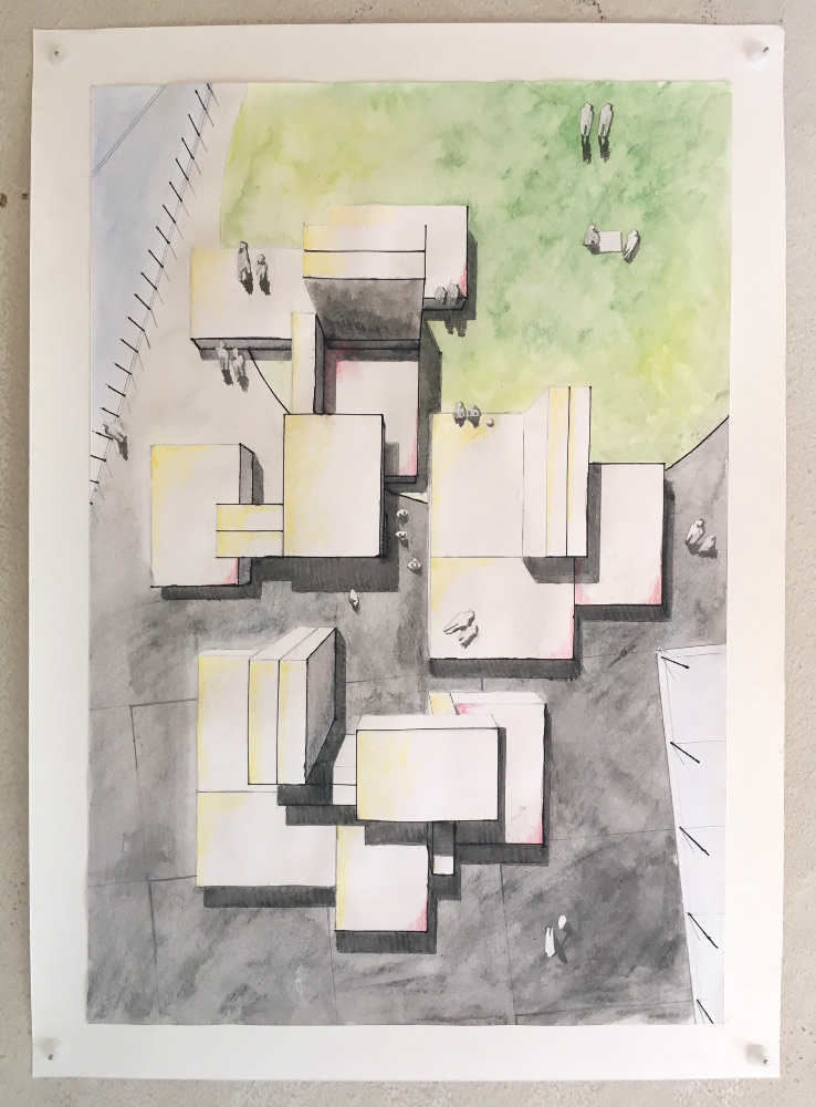
This video shows the incremental development of my recent piece ‘First Past the Post’ - a ‘real time’ concept painting that investigates the audience, colour theory and decision making.

Background

The premise for this work, in actual fact, arose from some self asked questions relating to something else. Sometime in early March I read the brief for a graphic design competition and produced two different contenders but became stuck as to which one I should submit. After failing to decide I asked a group of colleagues as to which one they liked and went along with whatever was most favoured.

Once I had submitted the work however, certain questions came up regarding what I had asked and the somewhat blind acceptance of the answers. All I had actually sent them was an image and two or three words about the theme of the competition, so how did they reach their final choice given the limited information? Instinct? Guessing? Or did something else influence it?

What really got me thinking is how people’s judgements are connected to facts or instructions. In the end, I thought that it would be fascinating to subvert this and somehow allow the audience to make the decisions that became the work itself. In the sense of what should be done; not what is done. My role as the artist being reduced to that of the maker.
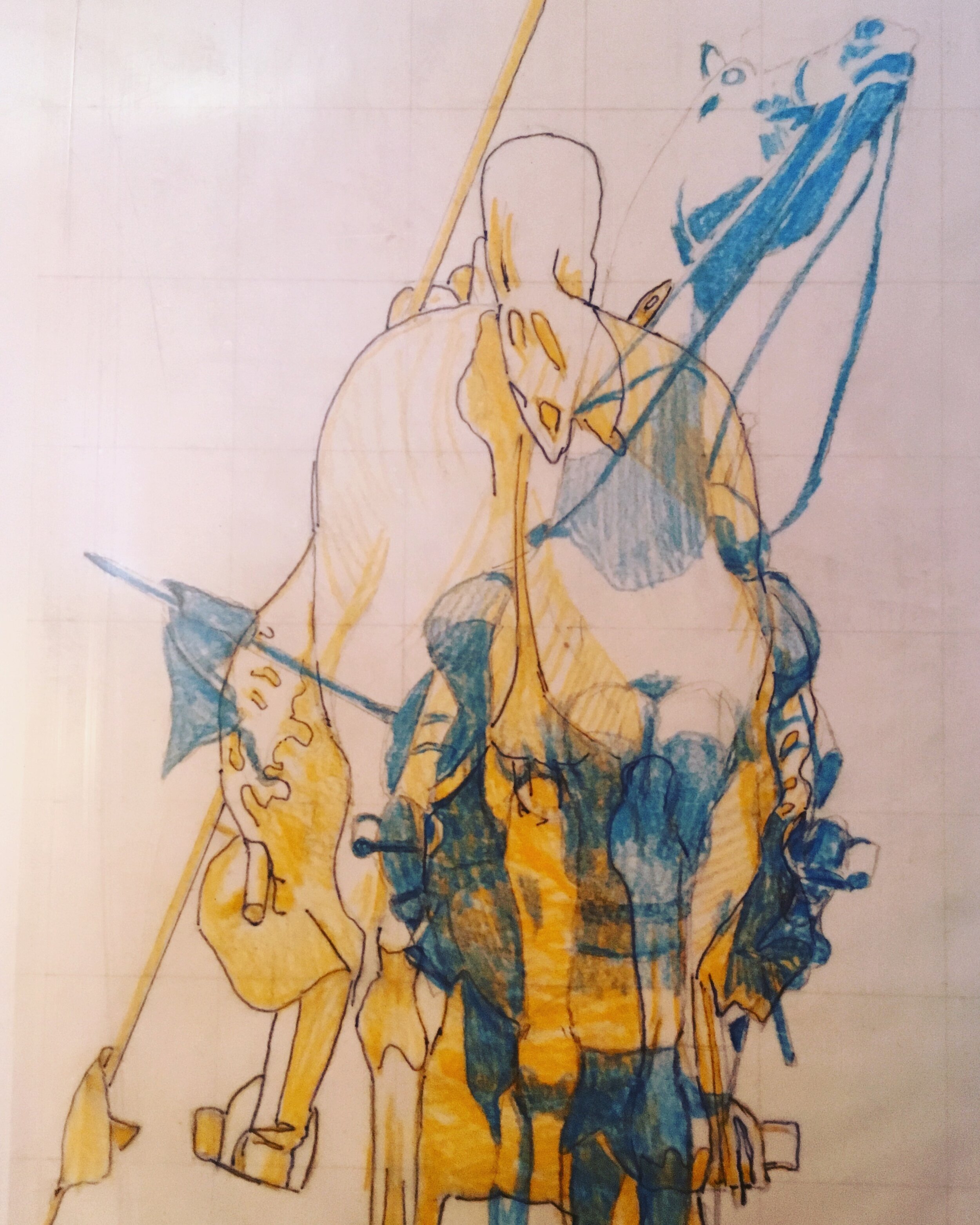
The piece

In order to make the work as simple as possible to the widest possible audience, my idea was to initiate one word responses that could repeat in real time, then translate them into some sort of code for visual representation. The prospect of changing people’s decisions into an abstraction definitely had some legs. But what could people choose from? A shape? A word? In the end, a range of colours seemed ideal in this case and led me to the construction of the rules. Here are some parts of the script from an instructional video, as the project was going out:

“The rules are simple. Pick one colour from the available list of ten, once a day. They range from primary, secondary and more synthetic colours”

“There is no real meaning for these other than that they are the representations of choice and embody the real question that we are asking; is there any connection between what you decide to do when presented with a seemingly unending process of randomisation.”

“Once a colour is selected and sent to me, it is then painted alongside the others for that day in the order that they were voted for. Colours that appear more than once in the poll are grouped together to create dominant blocks.”

The voting process for the artwork was carried out over various social media platforms with each day’s results being painted every morning for thirty six days. As the work progressed past its second week, some interesting patterns began to emerge despite the obvious nature of chance (namely the diagonals that radiates from day 19). Consequently, my thoughts ran to politics and how voting intentions etc. are often analised to the point of visual exhaustion (during election campaigns for example). The manic search for political significance is symptomatic of any poll in that they merely express opinion, but seeing as this artwork has no purpose (other than itself and its own completion) it raises some questions about the power of decision when related to a largely pointless activity. Were my collaborators choosing purely on the basis of aesthetic value or were there other things in play?

A further point to make at this juncture relates to the title. ‘First past the post’ is a political system whereby the first party to achieve a overall majority wins, thus rendering the remaining votes largely irrelevant. The title is a pun on this concept given that all of the votes were gathered through social media posts.

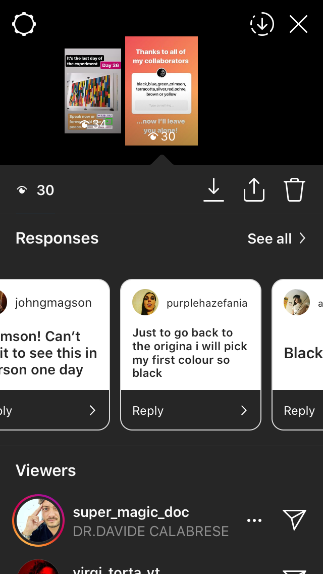
Some screenshots of the voting process

Summary

“A blind man can make art if what is in his mind can be passed to another mind in some tangible form” - Sol LeWitt

I enjoyed producing this work because I had relinquished all control regarding what should be done. For sure, I came up with the rules, the colours (straight from the tube) and the overall style of the piece but not its actual content. As a result, the lack of judgements regarding composition makes it an exponent of Process Art; a way of working which puts how something is made above the end product. To that effect, ‘First Past the Post’ has reaffirmed that my work should continue to go in this direction; the involvement of other people (albeit in this virtual form) gives each individual work a very different feel, despite each one beginning as a set of rules. I also find it interesting that some have now contributed to more than one piece; which now begs the question “Who is the artist?”

Thanks go to:

A.Fitzgerald, C.Pomes, A.Leone, A.Turner, S.Collura, K.Richards, S.Abate, V.Torta, Snitch Publishing, M.Druet, K.Horden, D.Partington, V.Janmeijs, M.Borelli, M.Vickers, B.Newsome, J.Ledger, P.Thomas, L.Leone, D.Vickers, F.Halliday, B.Vickers, R.Magson, J.Inglesi, J.Magson, A.Mew, B.Smith, M.Denitto, J.Lawrance, P.Vickers, M.Kunstler, J.Smith, R.Vickers


Straight from the horse's ass (part 2)

The concept took prescedence last week in part one, so I thought part two should contain some more technical details on the work but include some more insight as to how it is being made and why. The photos in the gallery (click to enlarge) are of the first piece in a series of five. They show the progression from the initial photograph to colour study and then full scale.

Speaking of scale, I found it essential to get as close as possible to a 1:1 (from the view at street level at least) to convey the uniformity that the chosen subjects have in the real world. Seeing as the concept is based on power, I found the decision to replicate and repeat entirely fitting.

The material is polythene, each of the five sheets measuring 2100x1500 mm. As painting on plastic is damn near impossible I had to experiment and produced a formula which I cannot disclose for obvious reasons.

When it came to the colour scheme (as you can also see in part one) the work relies heavily on the complimentary scale to represent duality. Contrasting colours such as blue and yellow speak of a number of different things, high on the list being political parties, moods or even personal preferences. However, the very nature of a clash, presented on two sides of the same object emphasises what people in power are inevitably conflicted by; that human nature often derails a principle.

The composition of each piece (as aforementioned) is based around the front and back of each monument. Due to the subsequent narrowness, each side makes an abstraction of the other (see part one for a better example) and the combinations sometimes give no real clarity on what you’re actually looking at. The blank areas on one side render the base layer of the other entirely visible and create an interesting dilemma on where to shift your vision.

In light of recent events in the UK; once the last part of this work is underway, the further political context of the work will be explored next week.

Here4 at Cavallerizza Irreale

May 2019. The debut showing of “Monument to the EU”, selected as part of the Here4 festival at Cavallerizza Irreale in Torino. The space allows for the full implementation of the project as I originally saw it. The sculpture is accompanied by photographs and technical drawings that make up the 2026 competition entry from LAS Architects Associates. Conceptually speaking, the piece draws from the current political fragility across Europe that has allowed for the rise of nationalism. The threat of EU breakup is very real and this work is prophetic in its intention. More information on the work itself can be read in the blog entry “Predicable Monumentalism”. The banality of the competition entry ‘visualisations’ highlights how the passage of time affects public spaces and monuments of this type.

The Cavallerizza Irreale is a community of multi-disciplined artists that occupy and maintain the premises of the old royal stables in Turin, Italy. The building was left abandoned for many years but now hosts a variety of exhibitions, performances and screenings. Here4 is the fourth edition of the festival and this years theme is ‘temporary cities’.

Timewasters...

These images make up part of an ongoing collection dedicated to lost time. The buffer screen is something that we are all familiar with and every single instance presents an interesting visual paradox. Each one is obviously part of something larger but because of a technical glitch the image becomes serendipitous and shown over a longer period than was intended. It gave me the opportunity to recognise formal qualities at random; something that you also do when presented with a painting or photograph that you haven't seen before.

No matter which platform that you are on, the loading symbol has connotations of frustration and 'dead time'... but purely because we are forced to look at it, the image behind it takes on much the same role that advertising does. You don't choose to look at it but it's there nevertheless.

Any guesses as to what they're from..?

Contribute with your own buffer moments #TimewastersArtProject. Further the collection!


Predictable monumentalism

Recent indecision and the seemingly unending problems regarding Brexit has given me the impression that the EU's days are most certainly numbered. The "Monument to the European Union" is a political work that represents my prediction of the future; that the EU will no longer exist and, at some point, architects will be invited to immortalize what it stood for. I have taken my cues from seeing other proposals for Public works in their documentative form. Photographs, sketches, written explanations etc. The successful proposals exist somewhere in the real world and have become part of the urban population's everyday experience. The failures on the other hand, rejected for whatever reason, give off the feeling of what could been, the possible alternative or if 'the grass is greener'. I have found this notion to be systematic of how many feel about Brexit and especially the contemporary opinion on the subject of nationalism.

The sculpture itself is a collection of twenty five plaster casts. Each being a representation of a motorway junction in and around Bruxelles. These stand for the very literal confusion and the list of potential outcomes that we now find ourselves in. In addition, by experimenting with the scale and digitally rendering a model into a realistic image, the question of how 'monumental' or 'substantial' it is comes to the fore.