Essays / Exhibition news / Publications

Bums on seats Part VI (Killing-time based work)

Many artists that I have spoken with would have heard me state that work needs to be finished quickly in order to avoid stagnation. Any protracted length of time allows your visual certainty to slowly escape like air from an unattended bike tyre, leaving you with more questions to answer than the singular one that got you started. This is something to be avoided at all costs. Yet there are some who embrace it, making time the essence of the work; the photographers, for example, that take the same kind of image every day for ages, portraits of themselves or their kids or whatever. In most cases, it’s some banal activity that represents a period of controlled creation, the length of that period usually being the most interesting thing about it.

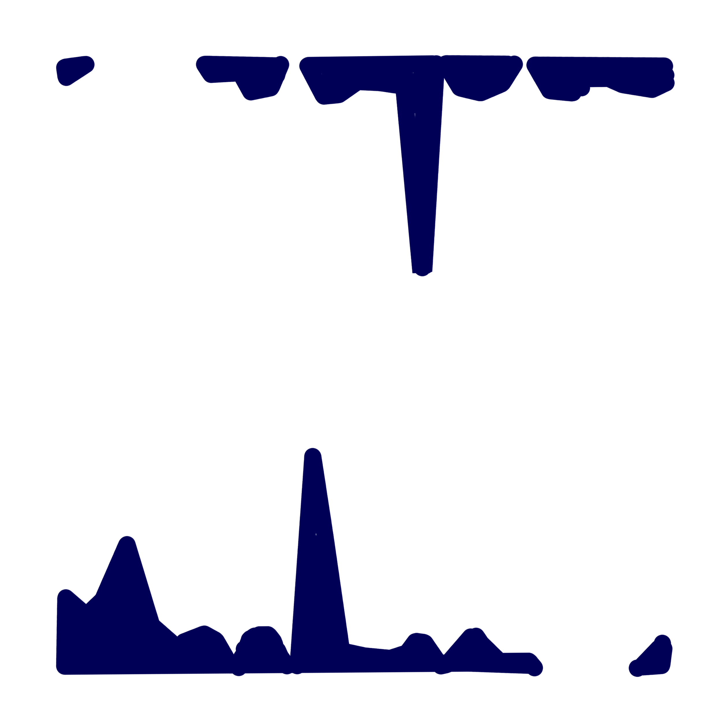
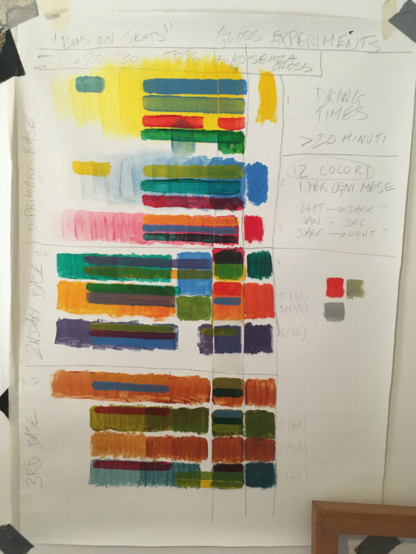
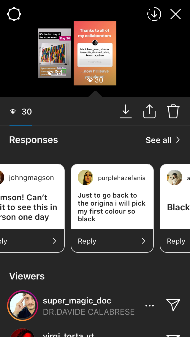
“Bums on seats” is lazily drifting into that category. I’m at the mercy of the system that I myself produced and it now feels like more of a ‘killing time’ based work than anything else. The data from October is in and transferred to canvas but nothing can be laid down until the end of the month- it would skew the results if I did. Coming up with a time based work halfway through the period that you intend to record puts you in a ridiculous situation when you catch up with yourself. It’s similar to when you exceed the allotted skips per hour of a certain audio service and then having no choice but to endure whatever dross they give you.

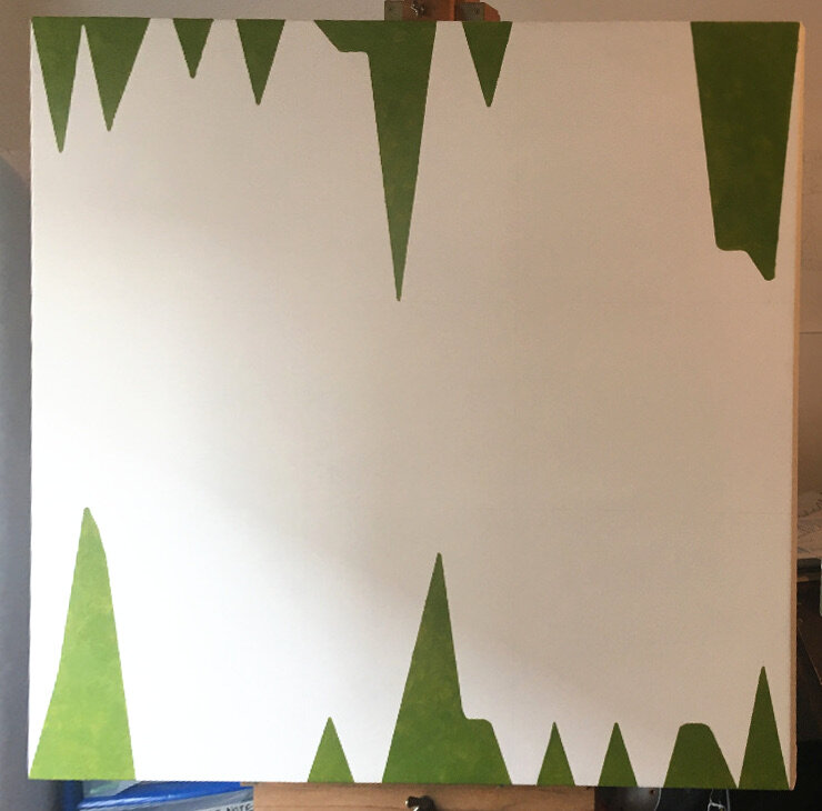
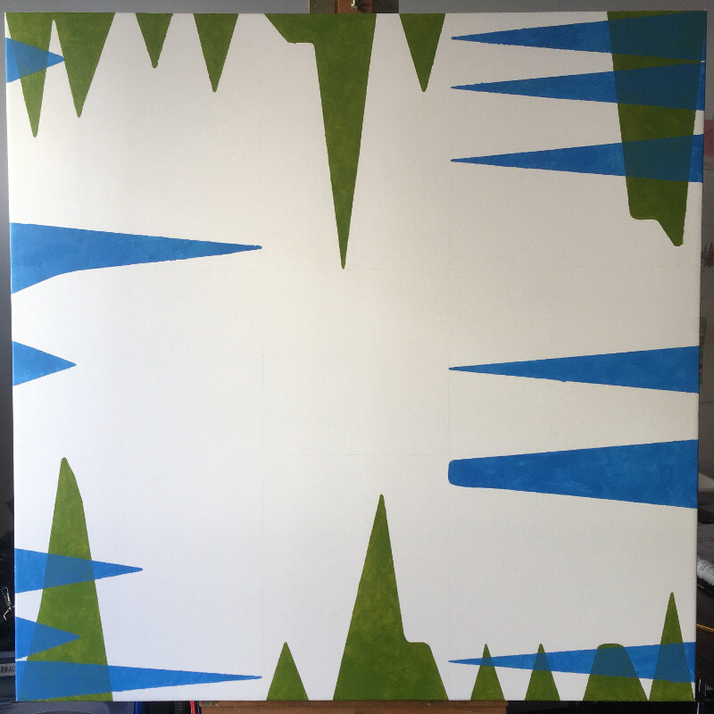
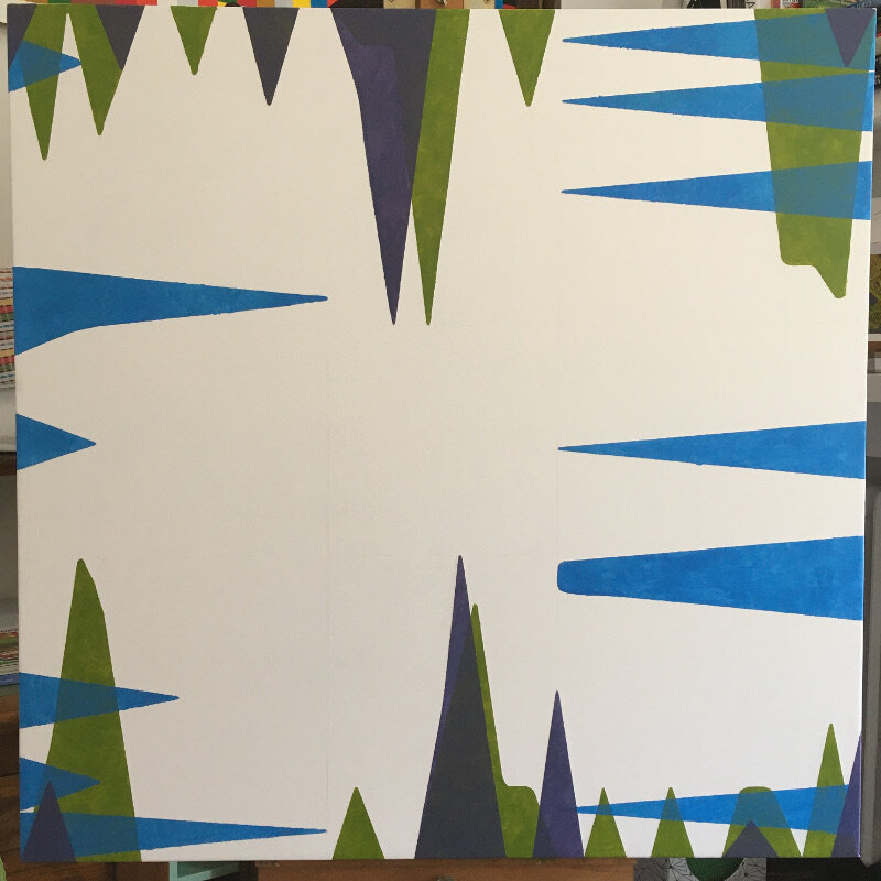
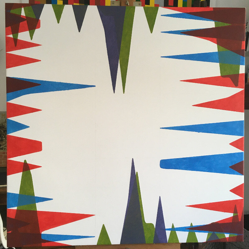
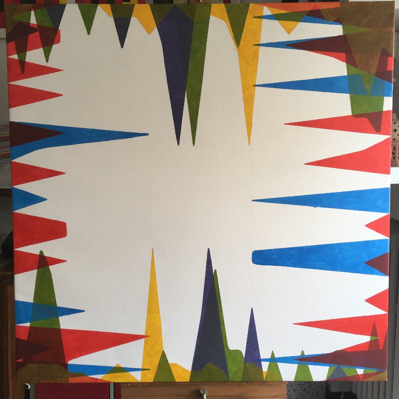
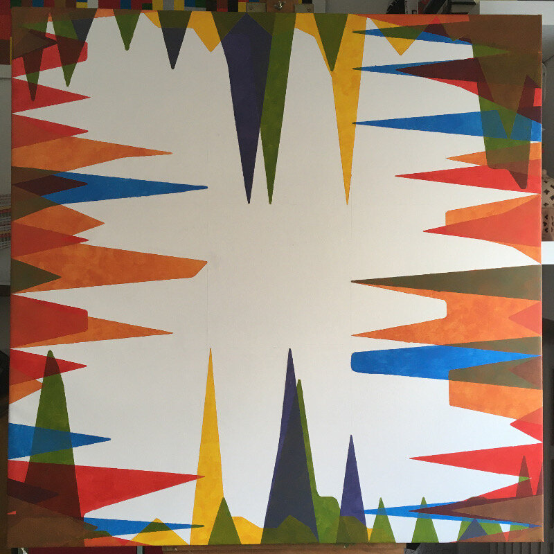
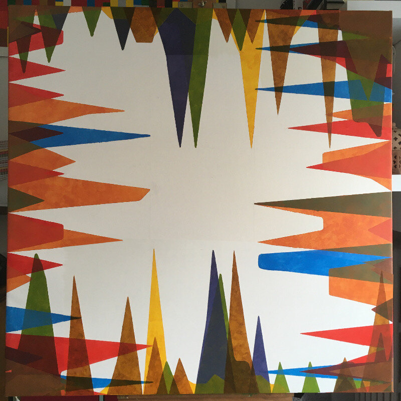
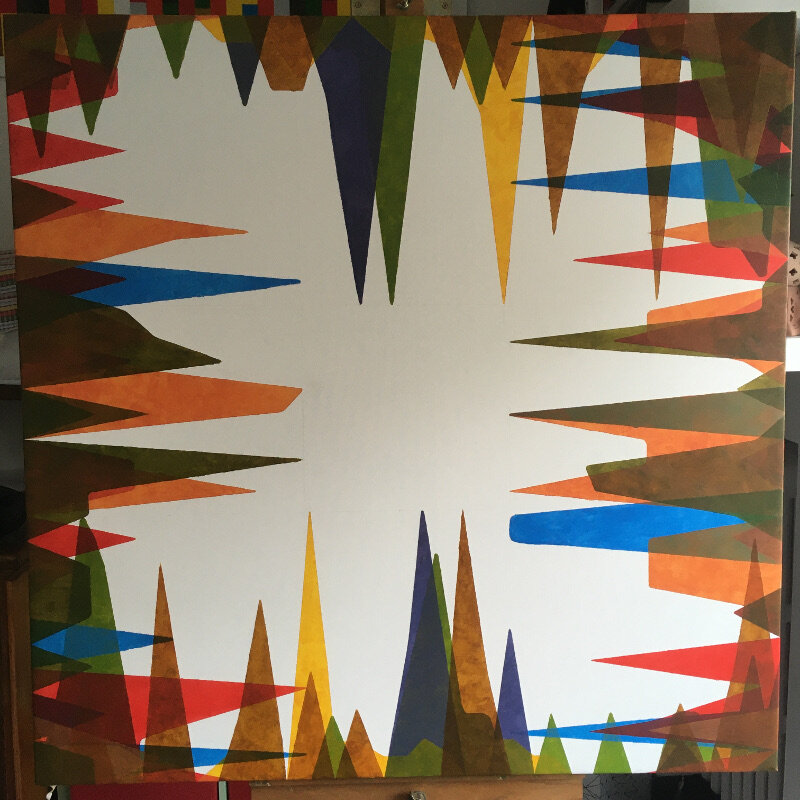
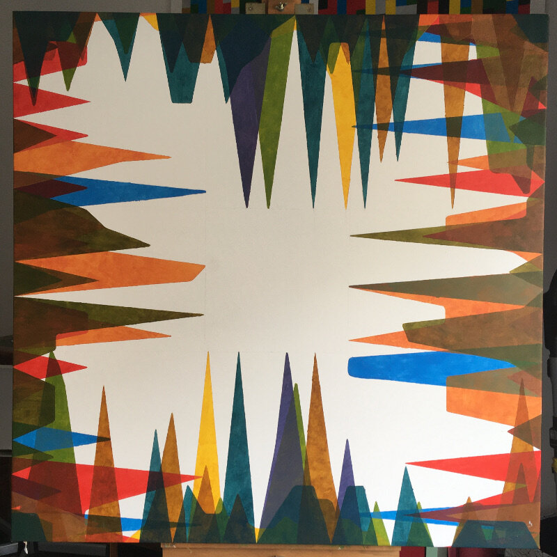
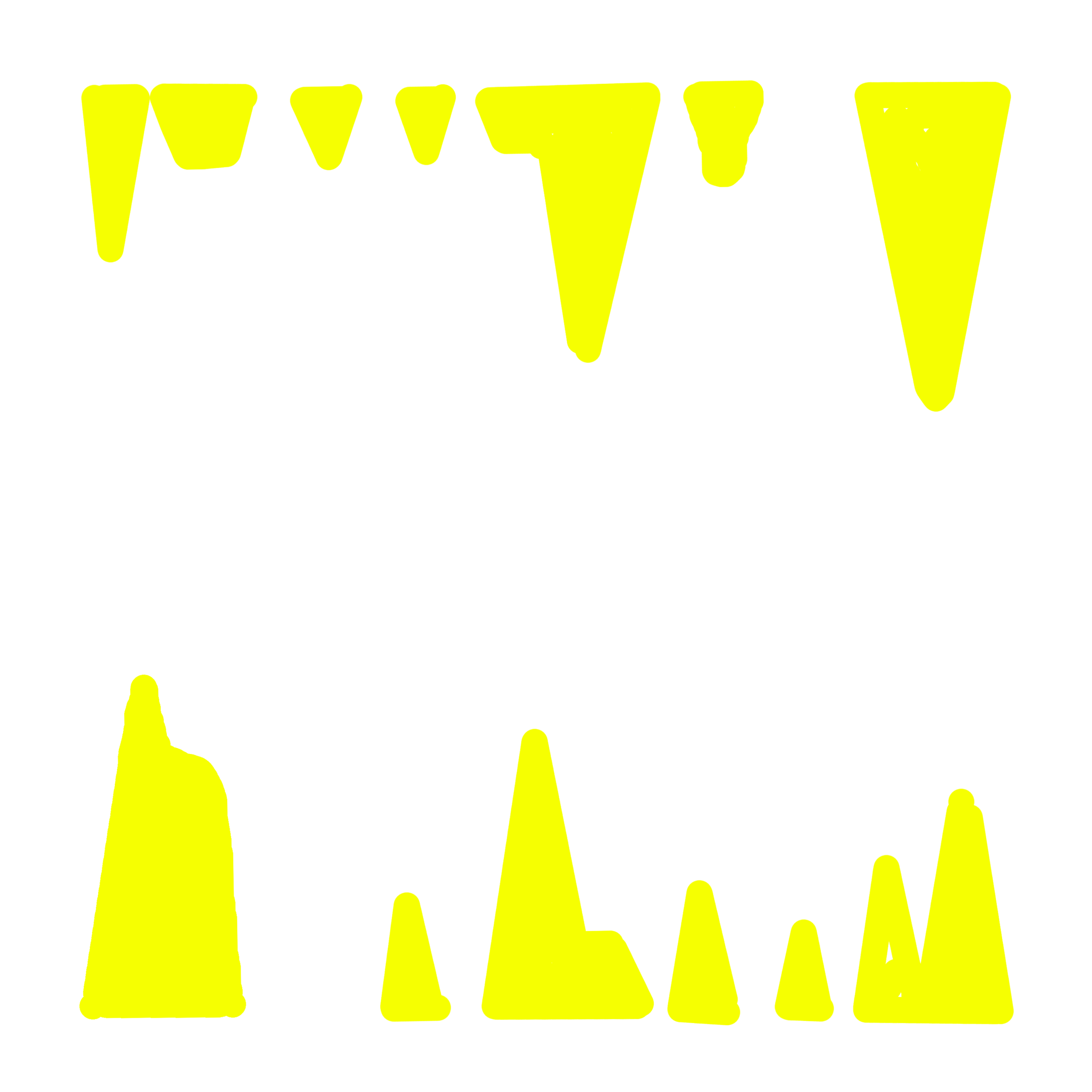
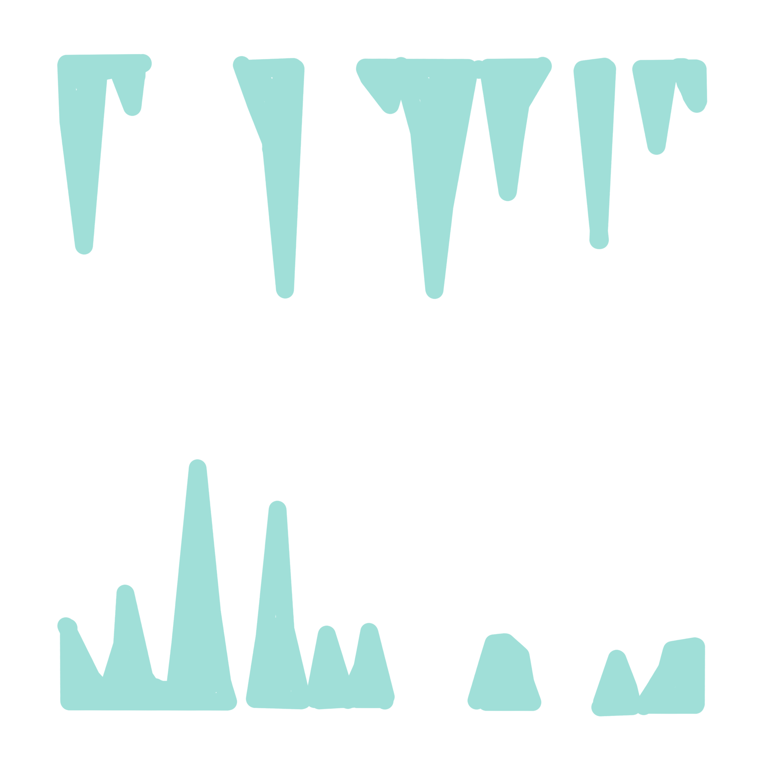
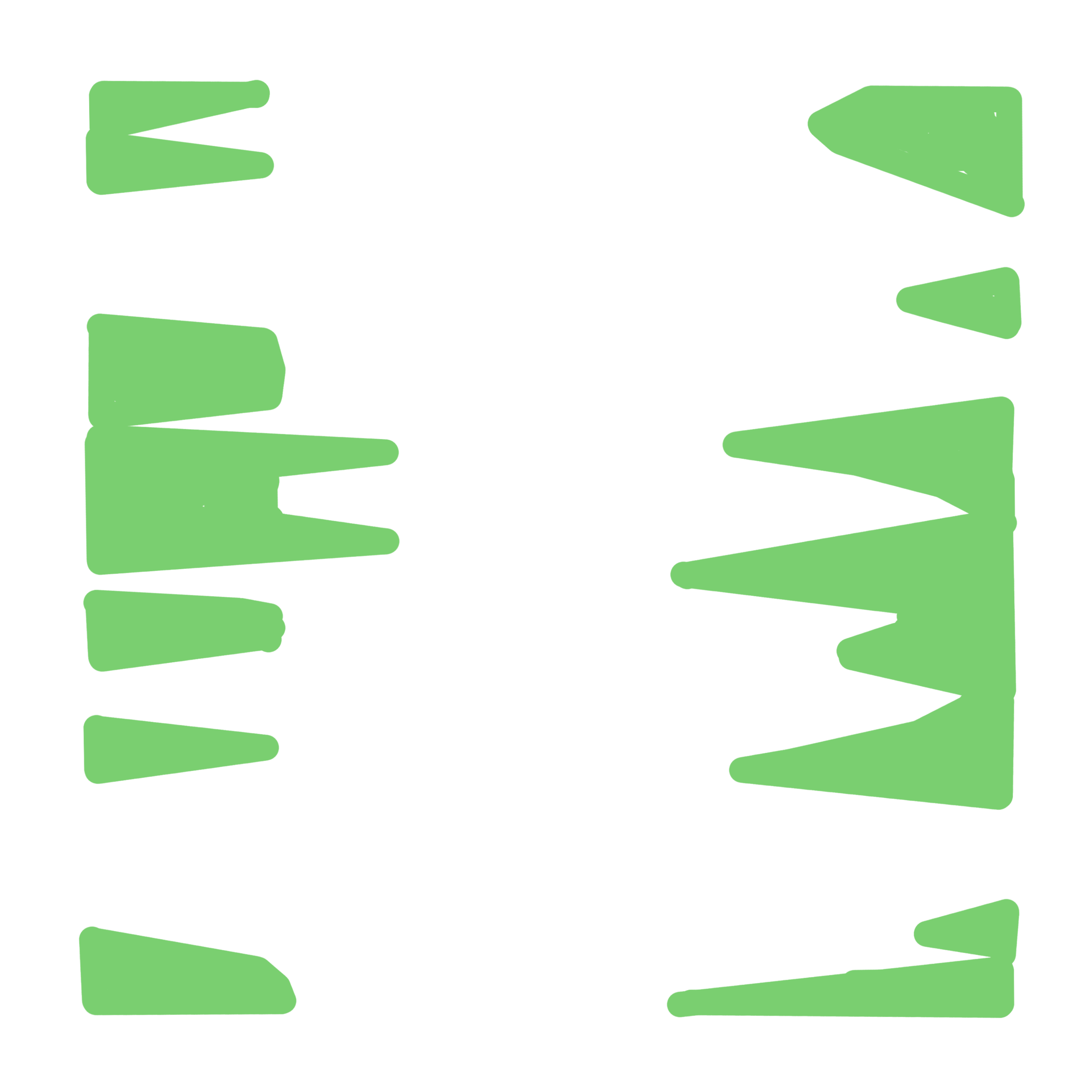
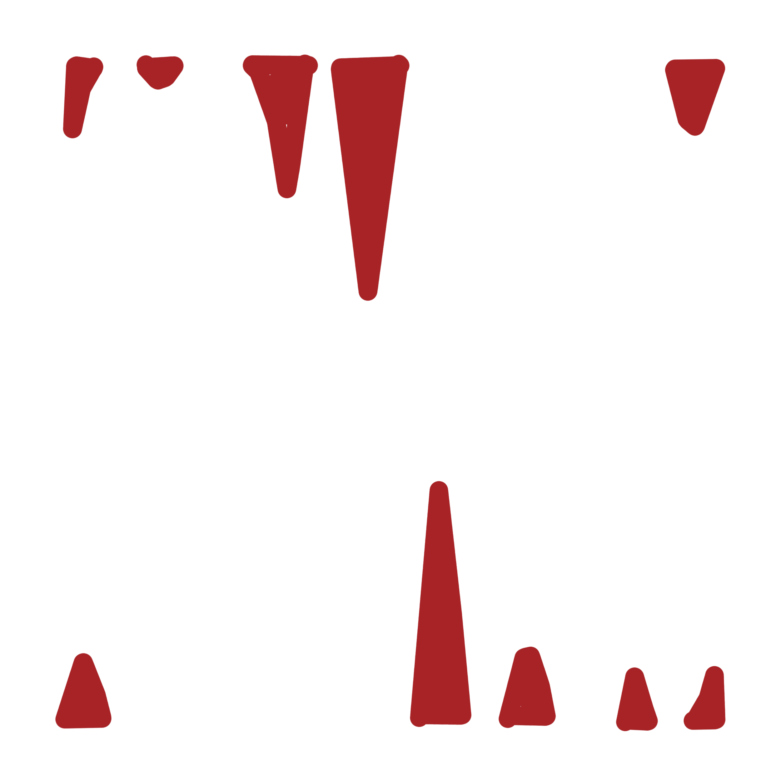
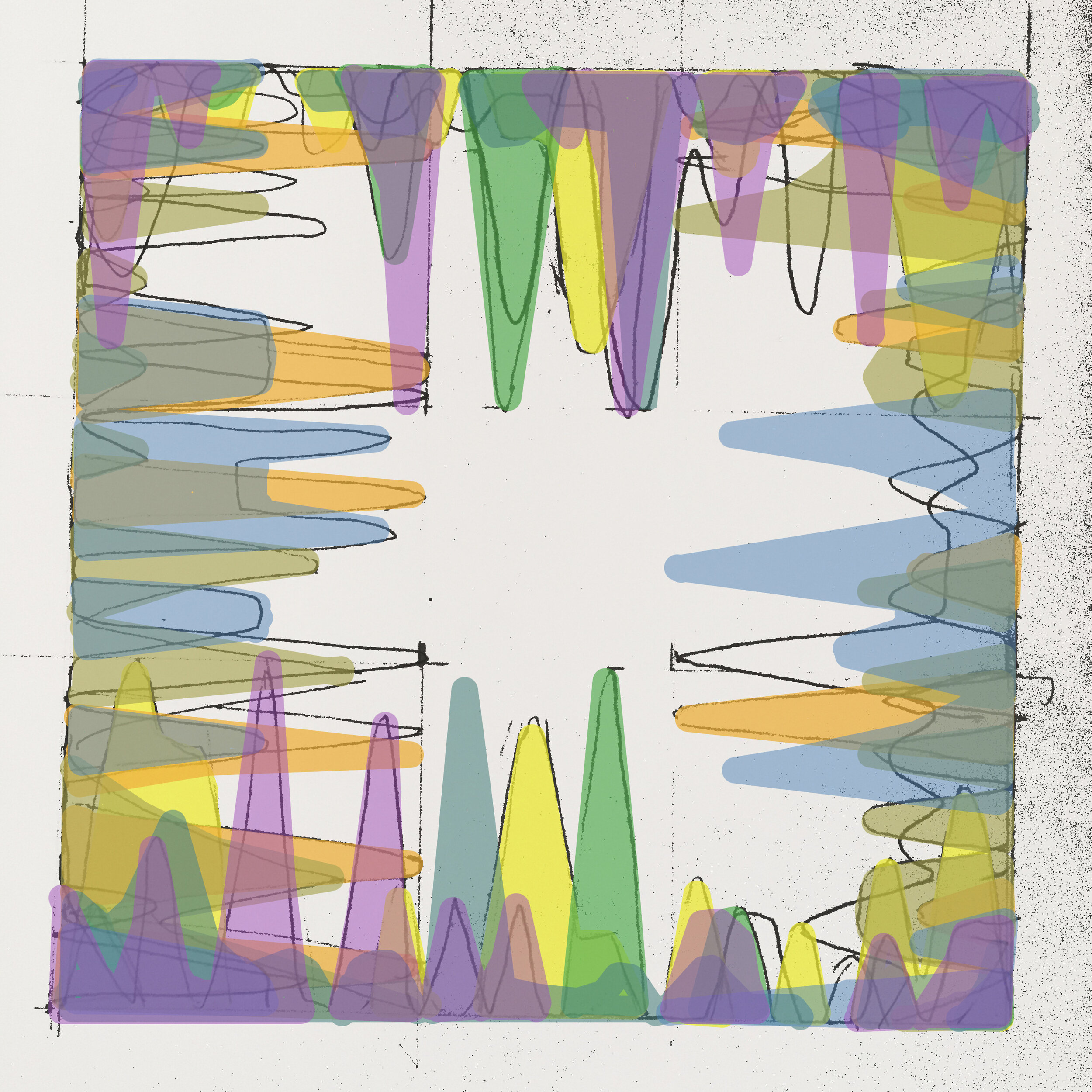
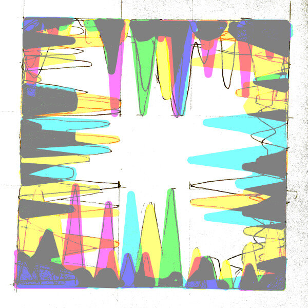
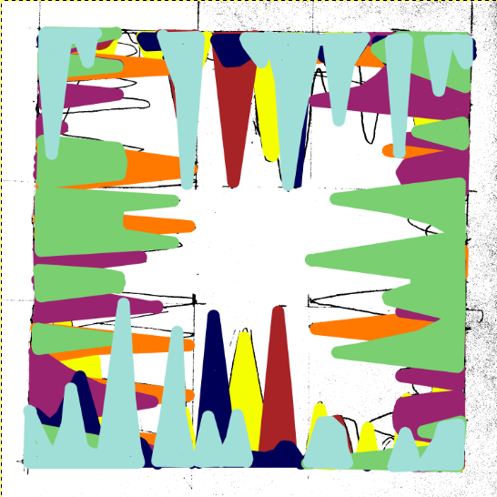
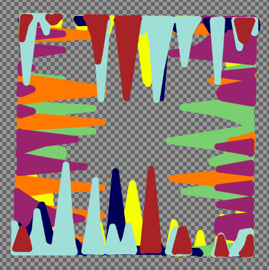
In any case here’s a review of the work month by month. It’s interesting that each colour is still largely discernible, even if the layers have started to blend into each to form a brownish blue. Schematically speaking, the plan is to paint the December results in a colour close to the bright green of January; thus representing the Internet’s never ending stream of information.

Bums on Seats Part IV

This week is all about colour. Yes I know, colour theory has been done to death but I feel that it’s important to consider it- especially following my recent works “First Past the Post” and “Straight from the Horse’s Ass”. I would also say that because I haven’t worked on a painting for a while (in the traditional sense) it serves as a reminder to not make any schoolboy errors. Experimentation is all well and good but the wrong choices will confuse everything. Or will they?

Up to this point the work has been mainly talking about the progression of time and the obsessive nature of your own online presence. So how do these abstract concepts relate to a colour scheme?

In truth it’s all down to interpretation; would I consider a month with crap viewing figures as being a cold colour? Or alternatively, would a green or a blue indicate a calmer feeling of, “oh well last month went alright so I don’t need to worry about it...”? On the flip side, warmer colours mean something different but essentially carry the same set of  contradictions. It’s a bugger alright.

Christ, don’t trip over your laces on the starting line, it’s only colour, they’ll fade over time anyway- which does in fact lead me into the next point. I mentioned the passage of time earlier and this work (which will account for a year’s worth of analytics) represents how something as trivial as a statistic is all consuming but is then quickly overtaken by the latest data set. In the gallery below are some of the tests that I have been doing, beginning on canvas. In the later versions, even though the simple progression around the colour wheel can be digitally altered to any preference, it’s interesting how complimentary colours cancel each other out even in a computerised simulation.      

The acrylic tests include some experiments with opacity using a gloss medium as a thinner. I would say that I’m unsure about which is the best ratio but in any case it felt like I was painting with dead expensive shampoo or conditioner- not ideal! However, translucency is something I should explore further as it gives the image more depth and would make a change from the block colours of the previous works.

Next week: preparing canvas ……..YAWN…… but seeing as I’m writing about everything…

Bums on seats dear boy! (Art in the Age of Analytics) Part Two

Look at me! Look at me! I’m writing about attention. I’m trying to be clever and ironic. Right? If you’ve decided to read on for Part Two then it must be working. So here is the explanation of the said idea.

Read More

Bums on seats dear boy! (Art in the Age of Analytics)

bums on seats banner.JPG

There’s an old saying in the English theatre business, “Bums on seats, dear boy, bums on seats”.

I heard it many times during my brief tenure as a spotlight operator some years ago, either in the auditorium itself, in the green room or after the show and I used to cringe every time someone uttered it. In any case it humoured me that this stereotype really did exist and that how such a comment on attendance rendered the quality of the actual show largely irrelevant. All that matters is how many people saw it.

The story, characterisation, music, lighting, script, backdrop etc- all crunched into a series of figures that can be looked back on as evidence of a hit once the run is over.

I am of course referring to if a show is in any way more popular than expected. If there are lots of people to see it each time, then in most people’s eyes, it’s considered a success; even if the production is awful and strewn with errors, “you can’t argue with the box office”. The added hype that circles around popularity has always been impossible to stop before it naturally ends up like a used ticket stub in a wet gutter somewhere.

I only mention this back story as a type of introductory allegory for what could be discerned these days as a by-product of the ‘attention culture’ and to broach the subject of this post.    

What is ‘attention culture’ and how did we get here? From my own perspective, artists have to compete with each other, let alone the general public and its difficult to say how long your ‘moment’ can last for; add to the story, add to the story, make it more goofy and irreverent so that everyone can see that you’re not a pretentious tosser.

Twenty four hours seems way too long in all honesty, it’s now down to mere seconds. It’s not just the creative industries either, anyone who publishes anything can become easily hooked on the rush that comes with grabbing someone else’s attention; stealing time from busy lives is essentially addictive…

I mainly speak of what social media has done to change our perception of what is considered as having the right kind of impact. I couldn’t count the number of times that I have fallen into the black hole of rolling news, dumb videos and other things far removed from what I initially logged on to do, just because I became quickly bored with it.

It seems quite vague as to why some things capture interest and others do not; how stuff becomes viral is anyone’s guess, most of the time it appears quite unintentional. The term ‘snowballing’ comes into this and can be achieved without a massive PR campaign.   

The universal ease of the Internet is a blessing for many, speaking as an artist in a socially restricted time but it is also a massive problem. People have always made art for sure but the way that it is recorded, delivered and discussed has completely changed over the last ten years or so; the limited life spans of social media networks and fanzines are certainly evident of an increasingly temporal frame of mind. The damage that digital saturation causes is a common theory and a well known issue but it also led me to think of a new piece that could ask questions about the attention culture.

Next week in Part Two- Conceptual Outline

First Past the Post - Project Review

First Past the Post

March/April 2020


This video shows the incremental development of my recent piece ‘First Past the Post’ - a ‘real time’ concept painting that investigates the audience, colour theory and decision making.

Background

The premise for this work, in actual fact, arose from some self asked questions relating to something else. Sometime in early March I read the brief for a graphic design competition and produced two different contenders but became stuck as to which one I should submit. After failing to decide I asked a group of colleagues as to which one they liked and went along with whatever was most favoured.

Once I had submitted the work however, certain questions came up regarding what I had asked and the somewhat blind acceptance of the answers. All I had actually sent them was an image and two or three words about the theme of the competition, so how did they reach their final choice given the limited information? Instinct? Guessing? Or did something else influence it?

What really got me thinking is how people’s judgements are connected to facts or instructions. In the end, I thought that it would be fascinating to subvert this and somehow allow the audience to make the decisions that became the work itself. In the sense of what should be done; not what is done. My role as the artist being reduced to that of the maker.

The piece

In order to make the work as simple as possible to the widest possible audience, my idea was to initiate one word responses that could repeat in real time, then translate them into some sort of code for visual representation. The prospect of changing people’s decisions into an abstraction definitely had some legs. But what could people choose from? A shape? A word? In the end, a range of colours seemed ideal in this case and led me to the construction of the rules. Here are some parts of the script from an instructional video, as the project was going out:

“The rules are simple. Pick one colour from the available list of ten, once a day. They range from primary, secondary and more synthetic colours”

“There is no real meaning for these other than that they are the representations of choice and embody the real question that we are asking; is there any connection between what you decide to do when presented with a seemingly unending process of randomisation.”

“Once a colour is selected and sent to me, it is then painted alongside the others for that day in the order that they were voted for. Colours that appear more than once in the poll are grouped together to create dominant blocks.”

The voting process for the artwork was carried out over various social media platforms with each day’s results being painted every morning for thirty six days. As the work progressed past its second week, some interesting patterns began to emerge despite the obvious nature of chance (namely the diagonals that radiates from day 19). Consequently, my thoughts ran to politics and how voting intentions etc. are often analised to the point of visual exhaustion (during election campaigns for example). The manic search for political significance is symptomatic of any poll in that they merely express opinion, but seeing as this artwork has no purpose (other than itself and its own completion) it raises some questions about the power of decision when related to a largely pointless activity. Were my collaborators choosing purely on the basis of aesthetic value or were there other things in play?

A further point to make at this juncture relates to the title. ‘First past the post’ is a political system whereby the first party to achieve a overall majority wins, thus rendering the remaining votes largely irrelevant. The title is a pun on this concept given that all of the votes were gathered through social media posts.

Some screenshots of the voting process

Summary

“A blind man can make art if what is in his mind can be passed to another mind in some tangible form” - Sol LeWitt

I enjoyed producing this work because I had relinquished all control regarding what should be done. For sure, I came up with the rules, the colours (straight from the tube) and the overall style of the piece but not its actual content. As a result, the lack of judgements regarding composition makes it an exponent of Process Art; a way of working which puts how something is made above the end product. To that effect, ‘First Past the Post’ has reaffirmed that my work should continue to go in this direction; the involvement of other people (albeit in this virtual form) gives each individual work a very different feel, despite each one beginning as a set of rules. I also find it interesting that some have now contributed to more than one piece; which now begs the question “Who is the artist?”

Thanks go to:

A.Fitzgerald, C.Pomes, A.Leone, A.Turner, S.Collura, K.Richards, S.Abate, V.Torta, Snitch Publishing, M.Druet, K.Horden, D.Partington, V.Janmeijs, M.Borelli, M.Vickers, B.Newsome, J.Ledger, P.Thomas, L.Leone, D.Vickers, F.Halliday, B.Vickers, R.Magson, J.Inglesi, J.Magson, A.Mew, B.Smith, M.Denitto, J.Lawrance, P.Vickers, M.Kunstler, J.Smith, R.Vickers