The latest version of the the fair, which has been running since May 2020, features a new virtual environment called the “Surface Gallery”. Upon entering, your sense of anticipation and curiosity is dampened by a string of loading messages but once the inevitable buffering ends you find yourself in a bizarre, Nintendo-esque meta-world, suspended over an endless sea.
Read MoreEssays / Exhibition news / Publications
Bums on Seats Part VII - Artwork Review
It might have taken five months to execute but “Bums on Seats” is now finished. Five months you say?! That’s ages! Well, let’s be glad that it wasn’t twelve as the concept points out - a year of analytical data on canvas that represents the weirdly obsessive nature of being a virtually present artist. Parts one to six of this essay series cover the original ideas, developments and other such matters (so start there if you’re new to this) but this one is a review - so was it all worth it?
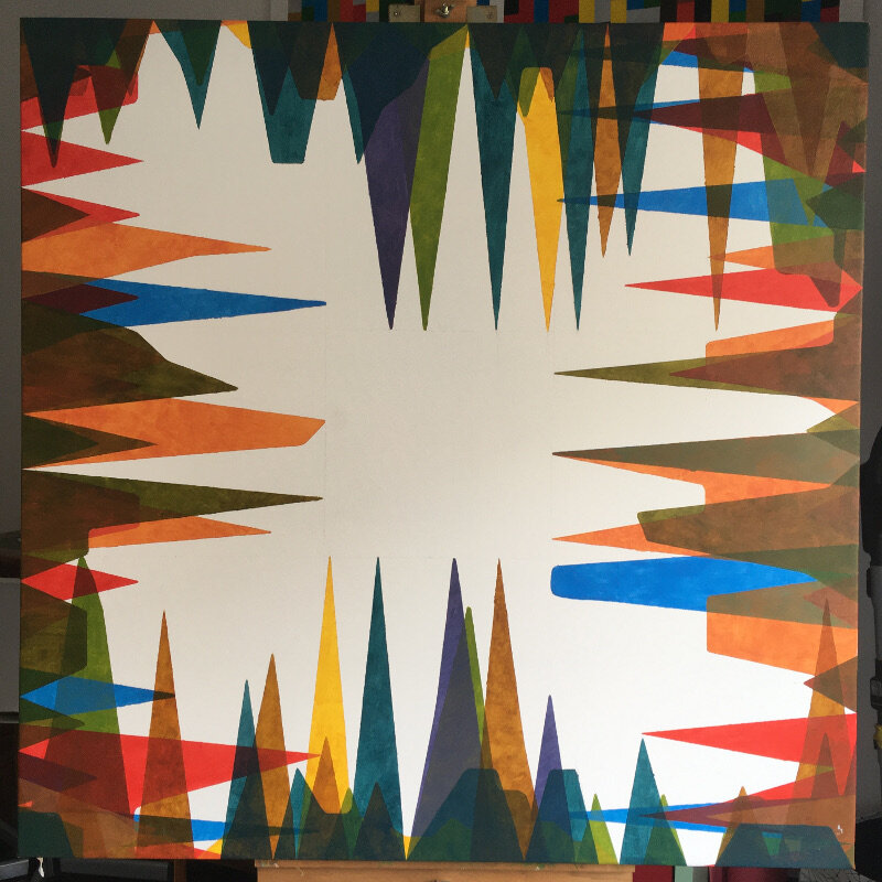
I think it certainly looks good; it’s quite close to what I had imagined back in August (gallery image 1) but the main observation would be that it now sits in a curious place between statistical exactitude and layered abstraction. The balance between the monthly colours was planned to flow from green back to green again (each one being a slightly different tint from the last) but threw up some difficulties in getting the right levels of medium transparency. But that’s just technical really- the overall effect is in keeping with its purpose.
The negative space works well and certainly reveals some patterns as to how my website is working. It has been perplexing to see people going mad for it one day but quieter than Hillary Clinton’s victory parade the next. One regret is not introducing some indicator of geography for “Bums…” which could have added extra meaning to it but nevertheless, it’s evident from this work that the site is at its hottest in the middle of the month. Do bigger numbers make you a better artist? Do lower ones make you a bad one? It’s a very modern dilemma but one that I hope that this work raises.
Working on canvas again after such a long time would be another positive that I can take from this piece. In fact, to have one hanging on the wall makes a refreshing change (gallery image 7) and producing a more subtle yet varied colour palette was fun (as opposed to “First Past the Post”, which was a straight from the tube affair).
I’m also happy to announce that “Bums on Seats” will be exhibited at the upcoming Fourth Edition of the Virtual Art Fair. Opening January 29th Curated by Lucy Fiona Morrison
Web link thevirtualartfair.co.uk/
Instagram @thevirtual.artfair
IPA (6.5% concept art)
A day job is one of those stubbornly real aspects that, as an artist, you try to suppress (or at least try not to mention) as much as possible. Such a dirty word spoils the romantic image of an artist existing for their own work and very little else. It does however, remain an image that is pushed on us as students; that having the freedom, time and space to do whatever you want equals success amongst your peers. If you still indeed have a day job, then you are tainted and linger in the realm of failure - simply due to its very existence. It’s certainly the case that you just don’t hear about most of the crap jobs that most noted artists have done because most biographers conveniently forget to include them; perhaps the justification being that such ‘a means to an end’ is irrelevant and purely circumstantial.
Yet this short essay aims to explain that without the day job then “The Dilemma” would probably never have been made. “The Dilemma” is a recent, conceptual work that addresses language, or more specifically, the language of art. It consists of a short statement printed onto a transparent PVC sheet and is hung by two bulldog clips.
Over the last few months, I have been negotiating the ‘sound’ of spoken English with some of my students. At certain points I have found myself broaching the subject of phonetics to illustrate what I mean, the most obvious example being the schwa - a term that is relatively unknown to non- native speakers (or native ones for that matter). In the beginning it was a bit lost on them as to why most British people say “cuppa tea” instead of “cup of tea” but once I had explained that it’s mainly down to laziness (like most languages) they gradually understood it. In the International Phonetic Alphabet the schwa is represented by an upside down ‘e’ and after having drawn it dozens of times on a blackboard, I noticed that this type of text creates a slight conundrum:
If the IPA is supposed to help people with clarifying a language, then why does most of it look like complete nonsense?
There is a case to be made that this alphabet, by its very nature, doesn’t place any real significance in the words but I would argue that normal words can be just as empty. My point here being that the language of art (or what has become ‘International Art English’) is now so up itself that art essays, press releases and catalogues have been littered with portentous, loaded words for some time - the nouns being particularly culpable. I can’t say that I’m blameless in this matter; there have been times when I’ve written ‘entropic spaces’ and ‘non-states’ etc because it seems like you’re not taken seriously if you don’t use IAE. Art is a foggy subject already but it’s still quite fashionable to mystify it even further by using such terms. Just pick out any exhibition leaflet and I guarantee that you will find at least a dozen.
“The Dilemma” is a representation of how language is generally used in the art world and an example of how concept art is one of the more contentious, yet ultimately fascinating, forms of art. So I thought that it would be interesting to display a conceptual idea in IPA – a comment on ‘understandability’ if you will. Here follows a version of the printed text and a recorded translation in English:
ɪn ˈɔːdə tə meɪk ðə saʊndz əv wɜːdz mɔː ˈtænʤəbl, sʌm ˈpiːpl juːz ðɪs ˈmɛθəd. ɪt ˈʤɛnərəli sɜːvz əz ə gaɪd tə prəˌnʌnsɪˈeɪʃən bət ˈlɑːʤli əˈmɪts ðə ˈmiːnɪŋ əv ðə wɜːdz ðəmˈsɛlvz.
djuː tə ðə fækt ðət ðɪs həz biːn ˈrɪtn aʊt əz sʌʧ kri(ː)ˈeɪts ðə ˈfɒləʊɪŋ dɪˈlɛmə:
həz ðɪs kənˈsɛptjʊəl ˈɑːtˌwɜːk biːn ˈrɛndəd ˈiːzɪə tʊ ˌʌndəˈstænd bɪˈkəz ɪt hæz, ɪn ə ˈsɜːtn weɪ, biːn spɛlt aʊt fə juː, ɔː həz ði aɪˈdɪə ˈmɪəli ˈdɪsɪpeɪtɪd ˈɪntə ə ˈsɪəriːz əv ˈlɛtəz ənd ˈsɪmbəlz ðæt, ət fɜːst glɑːns, meɪks ˈvɛri ˈlɪtl sɛns
Once I had changed this into IPA then the idea really did come alive. All the symbols that I recognised from teaching started to appear but because I had never really gone beyond one or two words in isolation before, the text just became an aesthetically pleasing mess.
So therein lies the joke. Artists and collectors use IAE on a daily basis but is really is style over substance, with the writer being the beneficiary of their own words. The back up joke lies with the fact that the statement is printed onto a transparent sheet, so are you rendering yourself invisible by using IAE or revealing yourself to be a fraud...? Maybe both.
If you’d like to find out more about IAE, then here’s a link to an excellent piece, written by A.Rule and D.Levine - produced by Triple Canopy.
https://www.canopycanopycanopy.com/contents/international_art_english
“The Dilemma” follows another text based piece, the first being “A Coincidentalist Work”, made in tribute to John Baldessari, who remains a huge influence up to this very moment of typing. He was also a teacher (the biographers mention this one quite famously) and in many ways the professorial attitudes of being direct, personable and ‘performative’ come through well in his text pieces- like the glaring immediacy of a teacher’s hand written note on a homework assignment.
Once I had thought of these ideas for my own work (either through a day job or not) I enjoyed wrestling with how funny they ought to be and furthermore, if conceptual statements like this offer little to the viewer apart from the artist’s own banal sense of self-awareness. I’m intrigued by the way that people sometimes roll their eyes at pieces like this; it signifies a level of understanding that it’s all too easy and breaks the stigma that is often attached to ‘unfathomable’ conceptual art. Sometimes making a point of stating the obvious isn’t such a bad thing.
Bums on seats Part VI (Killing-time based work)
Many artists that I have spoken with would have heard me state that work needs to be finished quickly in order to avoid stagnation. Any protracted length of time allows your visual certainty to slowly escape like air from an unattended bike tyre, leaving you with more questions to answer than the singular one that got you started. This is something to be avoided at all costs. Yet there are some who embrace it, making time the essence of the work; the photographers, for example, that take the same kind of image every day for ages, portraits of themselves or their kids or whatever. In most cases, it’s some banal activity that represents a period of controlled creation, the length of that period usually being the most interesting thing about it.
“Bums on seats” is lazily drifting into that category. I’m at the mercy of the system that I myself produced and it now feels like more of a ‘killing time’ based work than anything else. The data from October is in and transferred to canvas but nothing can be laid down until the end of the month- it would skew the results if I did. Coming up with a time based work halfway through the period that you intend to record puts you in a ridiculous situation when you catch up with yourself. It’s similar to when you exceed the allotted skips per hour of a certain audio service and then having no choice but to endure whatever dross they give you.
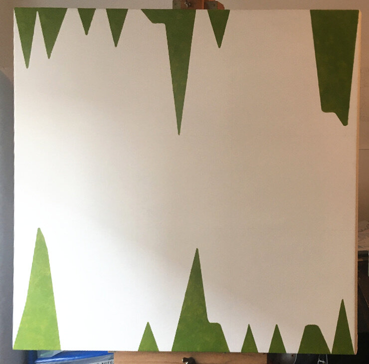
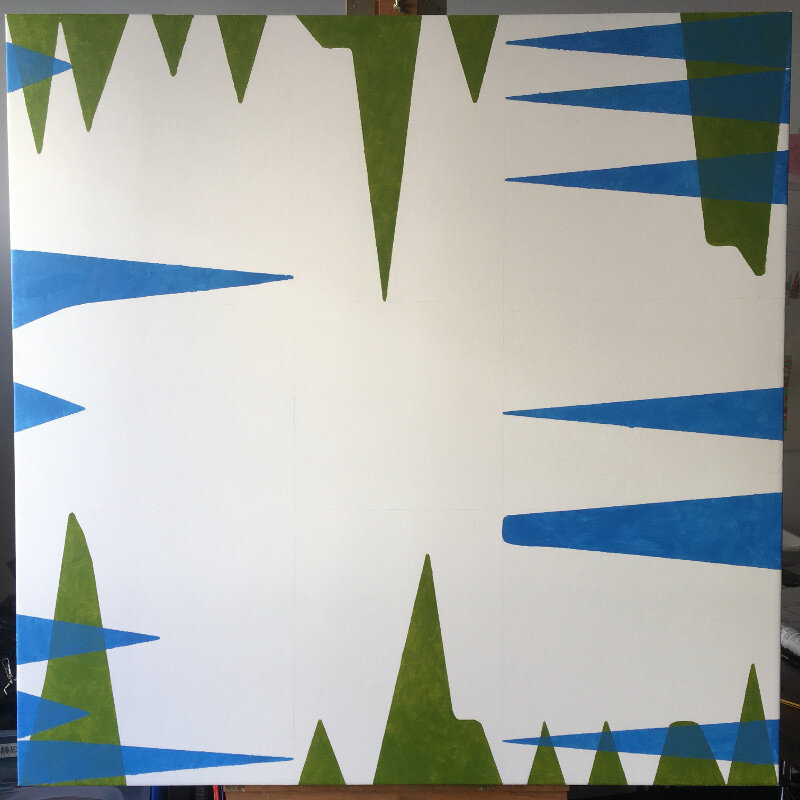
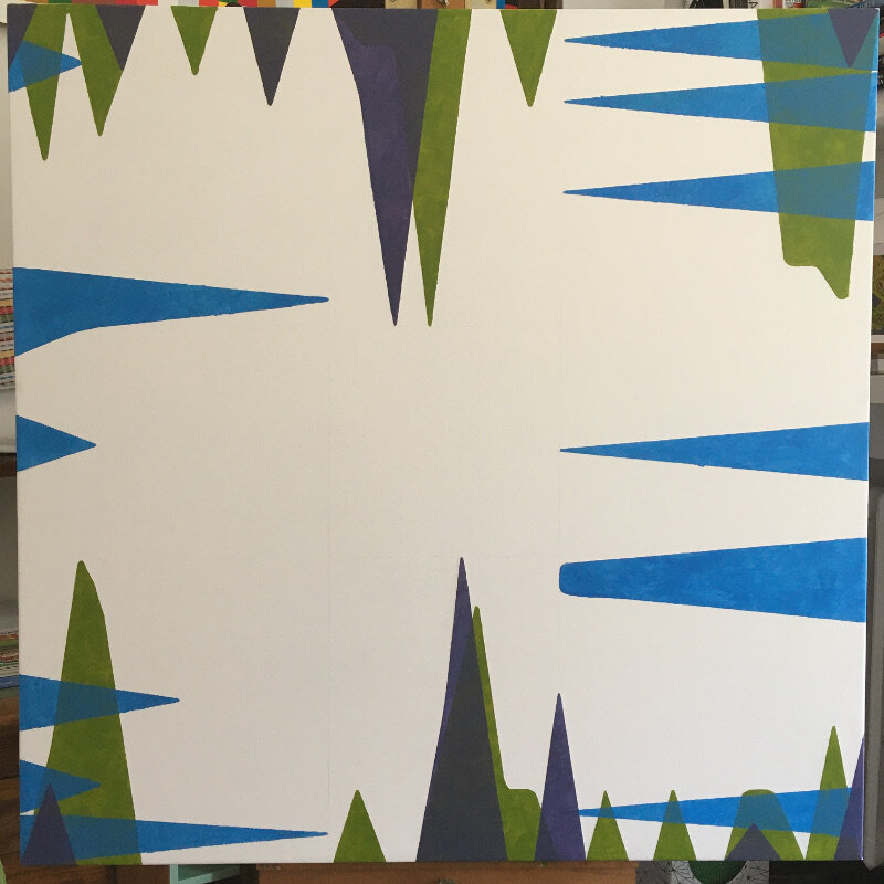
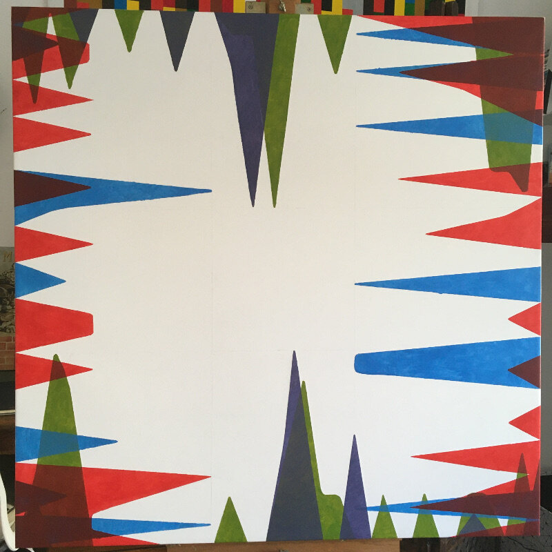
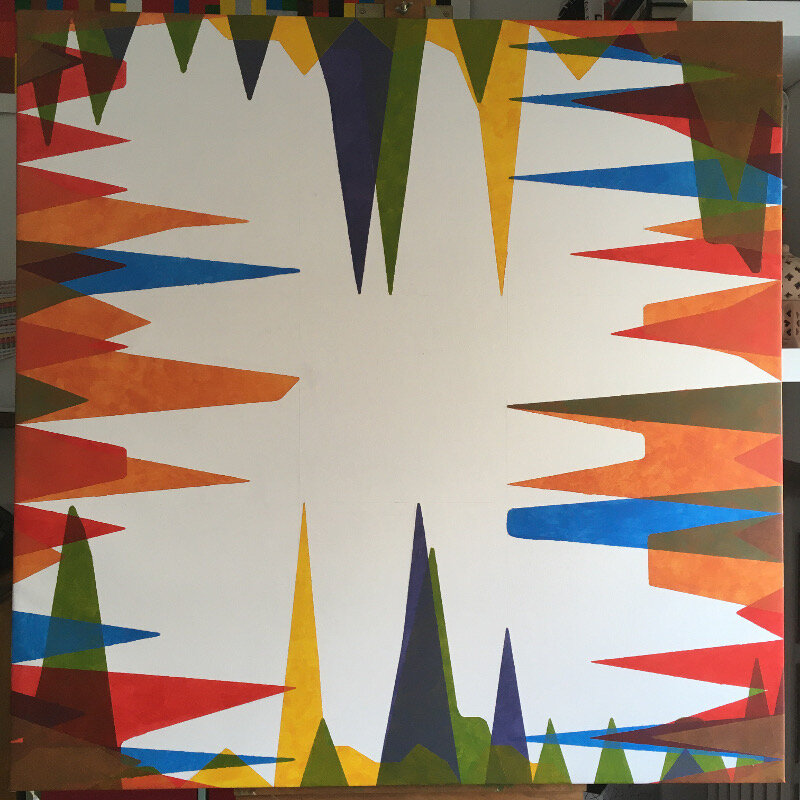
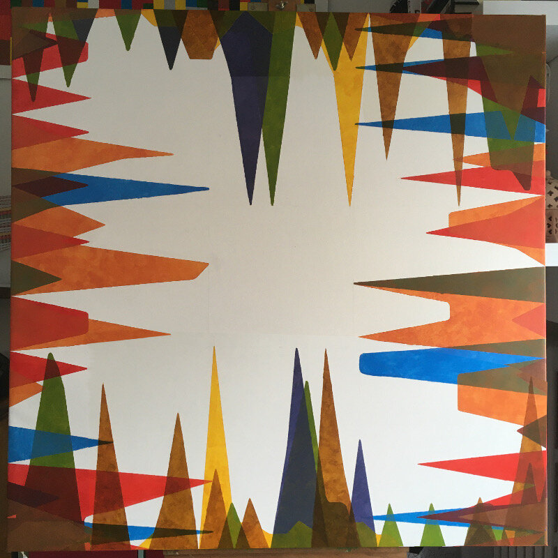
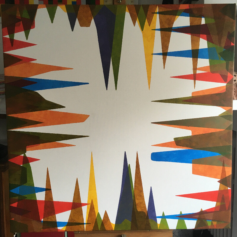
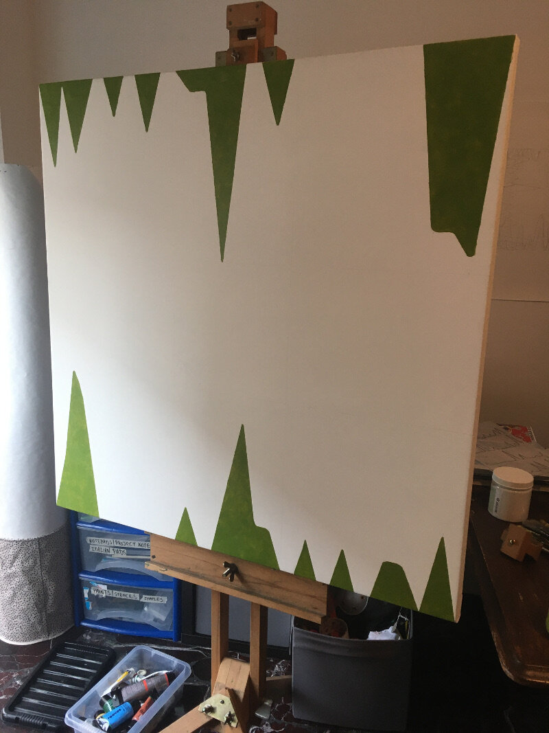
In any case here’s a review of the work month by month. It’s interesting that each colour is still largely discernible, even if the layers have started to blend into each to form a brownish blue. Schematically speaking, the plan is to paint the December results in a colour close to the bright green of January; thus representing the Internet’s never ending stream of information.
Bums on seats Part V (goodbye base camp)
It seemed a shame to ruin it really, this satisfyingly square first attempt at a canvas. Last week’s fear over what to do next turned into what I can only describe as a modernistic inertia, as it sat in the studio waiting to be defiled. I had built it up too much; that first gestural mark felt like it had to encapsulate everything that I’ve written about so far: the internet, attention culture, the old theatre crowd, colour theory and the death of interest. All things considered, this reluctance is the down side of having a clear concept in mind, there could never be anything spontaneous or automatic about this work, otherwise it would be a stab in the back- if only with a paintbrush. Yet, working to a plan gives a visual idea some semblance of intention and meaning, especially when something as flippant as colour comes crashing into the room; such a thing can throw you completely. A plan honours the original idea; if something stuck out in your mind as being better than something else in the beginning, then why not try to stay as close to that moment as possible?
I have said many times before that my work comes from the concept, a contextual version of base camp if you will. The best route, potential hazards and the appropriate equipment all depend on what’s decided over bacon and eggs- how do we get to the top without dying or losing sight of why we’re even here? They say each mountain climb is different and that goes for making art too but to continue this ‘lofty’ analogy would give you altitude sickness sooner or later so let’s get to the point- the interesting thing about “Bums on Seats” (working title) is that it carries on from “First Past the Post” and “Straight from the horse’s ass” in the sense that they are all rigorously planned, painted abstractions that represent a system. I say interesting because producing three examples of similar work in close succession is strange for me- I should be bored with it by now.
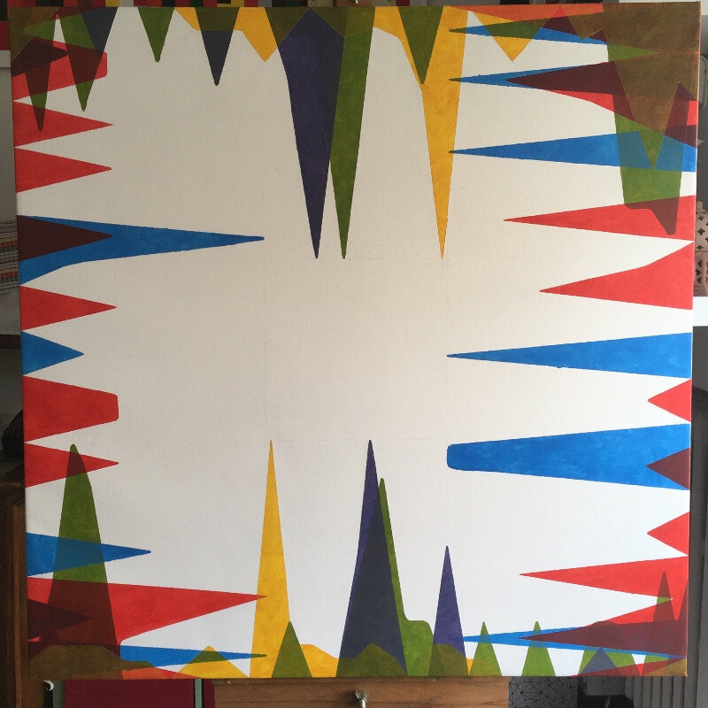
Onto the painting itself- I have started out with the data that relates to January and February. The composition relies on each edge of the canvas serving as the original x axis and the centre as the void that the subjects try to reach into. I’m looking for some balance within the painting so the matching colour spikes (relating to page views, visitors etc) will mirror each other from opposite sides. After conducting some experiments recently I am choosing colours that worked, or at least complimented or blended into each other to form a range of darker tones. As the layers become more complex I hope to see some colours either dominate or fade at first glance (in the same way that visitor hits from earlier this year barely seem relevant to what’s happening now, even if was an impressive statistic at the time).
My knowledge of oil paint is sketchy at best so this piece is being made with gloss medium and acrylics. Using the former would be like going up K2 without any decent boots…


